Colour does not have a single universal meaning, but it does carry strong associations for most people. Blue often feels calm or distant, yellow often feels bright or alert, and red often feels intense or urgent. Those associations come from a mix of nature, culture, language, and personal experience. A colour that feels peaceful to one person can feel cold to another, especially if it is tied to a specific memory.
That personal layer is why colour is such a useful journaling tool. When you choose a colour for the day, you are not taking a scientific test. You are giving yourself a shortcut to describe a feeling that might be hard to put into words. A grey-blue day and a warm amber day can feel completely different even if both days were, on paper, quite ordinary. The colour becomes a label you can recognise at a glance when you look back over a month of entries.
If you want to use colour more deliberately, try a simple exercise. Pick three colours for today: one for your energy, one for your mood, and one for what you wish the evening felt like. Write one sentence for each choice. You may find that your energy colour and your mood colour are different — tired but content, for example — and that distinction alone can make your reflection more accurate.
It is also worth being careful about claims. Colour can influence how a room, a picture, or a page feels, but it does not cure stress, fix sleep, or change a medical condition. Use colour as a creative language, not as a treatment. The value is in noticing, naming, and remembering, and in having a visual gallery that makes those patterns easier to see.
Over time, your own palette will emerge. You might discover that you reach for green on restorative days, or that orange appears whenever you feel brave enough to start something new. That personal palette is more meaningful than any generic colour chart, because it was built from your own days.
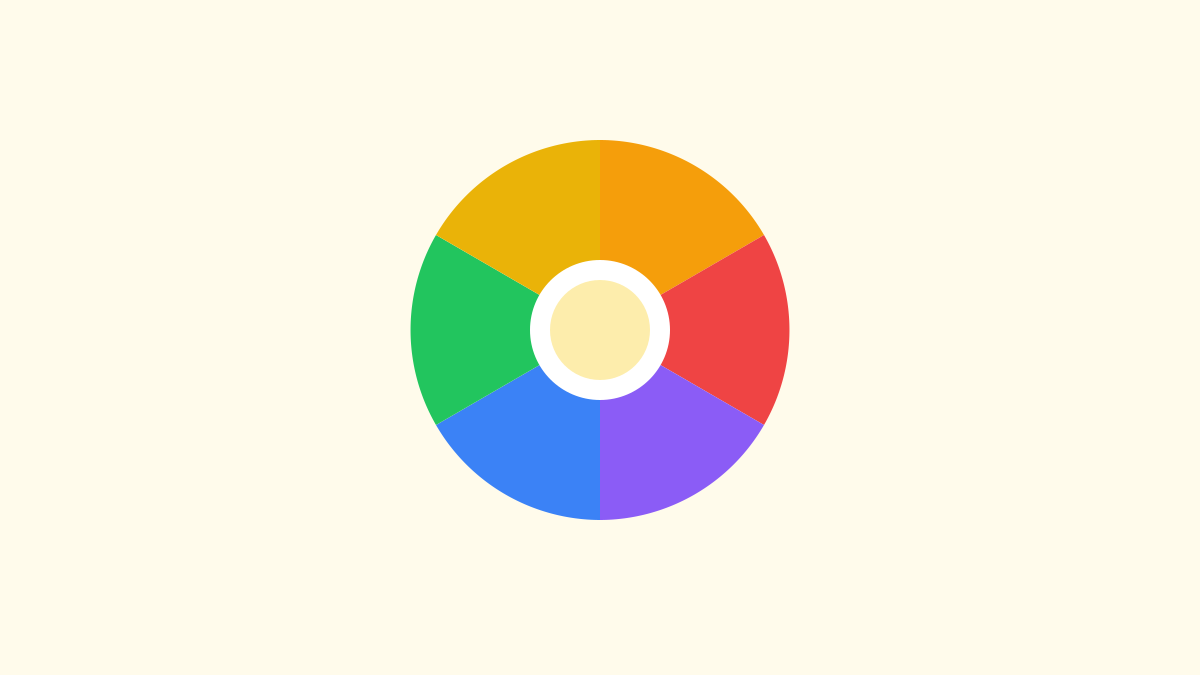
An original abstract colour wheel: a starting point for noticing, not a fixed chart of meanings.
Where colour associations come from, and why they differ
Colour associations feel obvious until you try to explain them, and then they turn out to be layered. Nature is one layer. Blue recalls sky and water, green recalls leaves and growth, yellow recalls sunlight, and grey recalls cloud, stone, and rain. Those natural links are shared by many people, which is why a blue page often feels cooler and a yellow page often feels warmer, even before you think about it. Culture is another layer. In some traditions white is associated with weddings and new beginnings, while in others it is associated with mourning. Red can signal celebration, luck, danger, or urgency depending on where you grew up and what you have seen it used for. Language adds a third layer, because phrases such as “feeling blue”, “green with envy”, or “seeing red” tie colours to feelings in everyday speech, even if you do not believe those phrases literally.
Personal experience is the layer that matters most for journaling. A particular shade of teal might remind you of a childhood holiday, a school uniform, a favourite jumper, or a room you loved. A particular red might remind you of a sports team, a warning sign, or a celebration. Those memories do not follow a chart, and they can override a generic association completely. That is why two people can look at the same colour and describe it differently, and why the same person can feel differently about a colour at different times in life. A colour that once felt exciting might later feel tiring, if it becomes associated with a busy period, and a colour that once felt dull might later feel restful, if it becomes associated with quiet mornings.
For a journal, that variability is a strength, not a problem. You are not trying to find the correct meaning of blue. You are trying to find what blue means to you, this month, in your life. If you keep a note of your own associations, you will build a personal dictionary that is far more useful than any generic list. You might write, for example, “Pale blue: slow mornings, quiet house, low energy but calm.” Or: “Bright yellow: busy, alert, a little restless, lots of ideas.” Those notes are not scientific claims; they are descriptions of your own experience, and they help you recognise a day at a glance when you look back. If you want a broader beginner guide to journaling itself, Mood Journaling for Beginners explains how one short sentence a day, with a mood word and a cause, can build a record that is honest enough to be useful.
It is also worth noticing how colour changes with context. The same blue looks different on a bright screen, on paper, in a dark room, or next to orange. A colour that feels calm as a background might feel cold as a large block, and a colour that feels energising as a small accent might feel overwhelming as a whole page. That is why art journaling often works best with combinations and proportions, rather than a single colour alone. A mostly calm page with a small bright accent can feel balanced, while a page that is entirely bright can feel busy. Noticing proportion — how much of a colour you use, and where — is a useful journaling skill in itself, because it mirrors how a day itself is rarely one feeling alone.
The three-colour day: a step-by-step exercise you can copy
The exercise from the opening of this article is worth doing slowly, because it is more powerful than it first appears. Each evening, or each morning if you prefer, choose three colours. The first is for your energy: how much physical and mental fuel you feel you have, from drained to buzzing. The second is for your mood: how the day feels emotionally, from flat to light, from tense to content. The third is for what you wish the evening, or tomorrow, felt like: a direction, not a demand. Write one sentence for each choice, in plain language, and keep the whole exercise to five minutes. The point is not to produce a beautiful palette; it is to separate three things that are often tangled together.
Here is an example of a completed exercise, with invented entries that show how different the three colours can be. Energy: dusty blue. “I slept badly and my body feels slow, even though my mind is busy.” Mood: warm amber. “I felt pleased after a good conversation and a walk, despite the slow start.” Wish: soft green. “I would like the evening to feel unhurried, with time to sit and read.” Notice how the three sentences together tell a fuller story than any single summary. The day was not simply “good” or “bad”. It was slow, pleased, and hopeful, all at once, and that combination points to a sensible evening: rest, rather than a busy plan, because energy is low even though mood is good. That kind of distinction is what makes colour journaling practical, not merely decorative.
Try the exercise for a week, and keep the three colours in a row each day, so that you can see them together at the end of the week. You might notice that your energy colour stays in the same family for several days, while your mood colour changes more quickly, or the reverse. You might notice that your wish colour is often the opposite of your energy colour, which can tell you what you are longing for, or that it is often close to your mood colour, which can tell you that you mostly want more of what is already working. There is no correct pattern, and you should not force one. The value is in seeing your own week as a visual row, where patterns, if they exist, become visible without you having to analyse every entry in words.
If three colours feel like too many at first, start with one. Choose a single colour for the day, write one sentence about why you chose it, and stop. After a week of single colours, add a second colour for energy or mood, and only add the third when the first two feel easy. If three colours feel too few, add a fourth for a specific part of the day, such as work, home, or social time, but keep the total small. A palette that is easy to repeat every day is far more useful than a complicated system that you abandon after three days. You can also use the colour palette tool on this site to pick a mood and get a copyable palette for artwork or journaling, which can be a helpful starting point on days when choosing colours feels hard.
A tour of colour families, with honest cautions
Blue is often described as calm, distant, or cool, and for many people that rings true. Pale blue often feels quiet and spacious, like a clear morning, while deep navy often feels steady, serious, or formal. Grey-blue can feel flat or thoughtful, depending on the day and the memory attached to it. In journaling, blue is useful for slow, reflective, or restful days, but it is worth noticing when blue starts to feel cold rather than calm. If a blue entry feels lonely rather than peaceful, write that distinction down, because it is exactly the kind of personal nuance that makes your palette yours. Blue is also a good background colour for pages, because it recedes and lets other colours stand out, which mirrors how a calm day can make a small bright moment more visible.
Green is often associated with growth, nature, rest, and balance, and it is a colour many people reach for on restorative days. Sage green often feels soft and quiet, while bright green often feels fresh and alert. Olive green can feel earthy and grounded, while mint can feel light and clean. In a journal, green can mark days when you felt restored, outdoors, or steady, but it can also mark days when you felt stuck in a routine, if green reminds you of a particular place or period. As with every colour, the personal association matters more than the generic one. Try using green for a week of entries and see what it actually means to you, rather than assuming it must mean calm.
Yellow and gold often feel bright, alert, or warm, and they are colours that demand attention. Pale yellow can feel gentle and sunny, while bright yellow can feel energetic, cheerful, or slightly restless, depending on how much of it there is. Amber and gold often feel warmer and richer than pure yellow, and they are useful for days that felt pleased, proud, or quietly warm, rather than loudly happy. In a page, a small amount of yellow can lift a calm palette, while a whole page of bright yellow can feel busy. That proportion lesson is useful beyond colour: a small bright moment can change a whole day, without needing to dominate it.
Orange often feels warm, social, or brave, and it sits between the brightness of yellow and the intensity of red. Peach often feels soft and friendly, while vivid orange often feels bold, playful, or a little daring. Many people reach for orange on days when they start something new, speak up, or try something outside their usual routine, which is why it can become a marker for courage in a personal palette. At the same time, orange can feel loud or restless if there is too much of it, or if it reminds you of a busy, noisy period. Notice both sides, and let your own entries decide what orange means for you.
Red often feels intense, urgent, or passionate, and it is the colour most likely to be misused as a simple label for anger or danger. In journaling, red can mark many different experiences: excitement, embarrassment, physical energy, a difficult conversation, a celebration, or a day that felt full and fast. Burgundy often feels richer and slower than bright red, while coral often feels warmer and softer. If you use red, write a sentence about which kind of intensity you mean, because “red day” alone is too vague to be useful later. A red entry with a sentence — “Red: fast day, lots of energy, hard to slow down” — is a record. A red entry without a sentence is just a colour.
Purple and violet often feel creative, reflective, or a little mysterious, and they are colours that many people associate with imagination, evening, or quiet thought. Lavender often feels soft and dreamy, while deep purple often feels rich and serious. In a journal, purple can mark creative days, thoughtful evenings, or days when your mind felt busy with ideas, but it can also feel distant or heavy if it is too dark or too large a block. Pink, which is often grouped nearby, has its own range: pale pink often feels gentle and tender, while hot pink often feels bold and playful. Both are useful, and both deserve a sentence, because “pink” alone could mean many different days.
Neutrals — grey, brown, beige, black, and white — are often overlooked, but they are essential for a journaling palette, because many days are neither bright nor dramatic. Grey can feel flat, thoughtful, or restful, depending on shade and context. Warm brown can feel grounded and earthy, while cool grey can feel distant or quiet. Beige and cream often feel soft and unobtrusive, which makes them good backgrounds, while black can feel strong, formal, or heavy, and white can feel clean, empty, or spacious. Do not dismiss a neutral day as a boring day. A grey entry with a sentence — “Grey: quiet, slow, nothing dramatic, but steady” — is an honest record of a real day, and a month of such entries can show a steadiness that brighter entries might hide.
Colour and personal memory: an exercise in three layers
A useful way to deepen your palette is to trace one colour through three layers of memory. First, choose a colour that appears often in your entries, or one that you feel strongly about, positively or negatively. Second, write three short notes: one about nature or the world (sky, sea, leaves, sunlight), one about culture or language (a tradition, a phrase, a team, a flag), and one about a personal memory (a room, a garment, a place, a person, a period of life). Third, read those three notes together and ask which layer feels strongest for you, right now. That layer is likely to shape how you use the colour in your journal, and naming it can prevent a generic association from overriding a personal one.
For example, a reader might trace teal and find that nature suggests sea and calm, culture suggests a particular sports team, and personal memory suggests a childhood holiday by the coast. Together, those layers might make teal feel both calm and nostalgic, which is a richer meaning than “calm” alone. Another reader might trace the same teal and find that personal memory suggests a school uniform they disliked, which makes teal feel restrictive rather than calm. Both readings are valid, because both are built from real experience. The exercise is not about finding a correct meaning; it is about making your own meaning explicit, so that future entries are easier to read back and less likely to be misunderstood by future you.
You can also trace a colour forward, not just backward. Choose a colour you rarely use, and try using it for a week of entries, even if it does not feel natural at first. Write a sentence each day about how the colour feels in that entry, and notice whether it starts to acquire a new association. Perhaps a colour you once thought of as dull begins to feel restful when you use it for slow mornings, or a colour you once thought of as loud begins to feel joyful when you use it for small celebrations. That kind of deliberate experiment can expand your palette, but it should be done lightly, as a creative exercise, not as a test you must pass. If a colour still feels wrong after a week, drop it. Your palette should fit you, not the other way around.
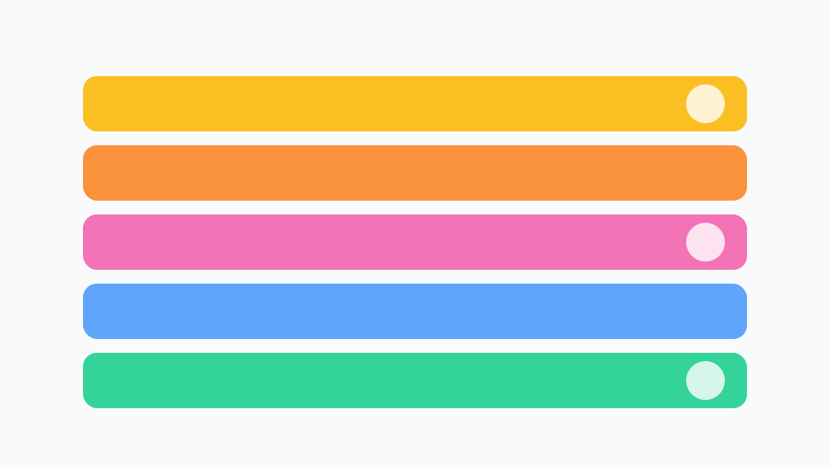
A palette in rows: warm and cool colours side by side, so you can compare what each one actually feels like to you.
Using colour in art journaling, step by step
Colour journaling becomes most satisfying when it moves from a word or a dot into a page you can look at. Start with a simple page, not a masterpiece. Choose your three colours for the day, or a single colour if that is easier, and make a page that uses those colours in shapes, not words alone. You might draw three large shapes, one for energy, one for mood, and one for your wish, and fill each with its colour, adding a short sentence underneath each shape. Or you might make a gradient that moves from your morning colour to your evening colour, with a sentence at each end. Or you might make a row of dots, one for each part of the day, and colour each dot according to how that part felt. All of these are valid art journal pages, and none requires drawing skill.
Proportion matters here, as it did with colour families. Try making the largest shape correspond to the feeling that dominated the day, and the smallest shape correspond to a smaller but still real feeling. A day that was mostly calm with a small bright moment might become a large pale blue shape with a small yellow dot, which is a more honest picture than a page that is half blue and half yellow. A day that was mostly busy with a quiet evening might become a large warm shape that fades into a small green shape at the edge. Those proportions are not rules; they are ways of showing, visually, what a day actually felt like, in a form that words alone sometimes miss.
You can also use colour to build a gallery over time, which is where the visual approach really pays off. The gallery on this site shows curated examples made only with gradients and shapes, and you can make your own gallery by saving a small artwork for each week, or each month, using the colours that appeared most often. The mood art generator can help here: choose a mood and intensity, generate an original canvas artwork, and download it as a PNG to keep alongside your entries. Some people use that artwork as a cover for a week of colour entries, while others use it as a starting point and then add their own shapes and sentences around it. Either way, the gallery becomes a visual record that you can browse in minutes, where a month of entries becomes a row of colours and shapes that you can recognise at a glance.
If you like digital tools, you can also keep a colour log in a simple table or note: date, energy colour, mood colour, wish colour, one sentence each. That log is less beautiful than a painted page, but it is searchable and easy to review, and it can be a useful companion to a visual gallery. If you like paper, a small sketchbook with one page per week, divided into seven rows, can work just as well. The best system is the one you will actually use, and the best page is the one you will actually look back at. Do not let a desire for a beautiful gallery prevent you from making a simple, honest page today.
Colour, seasons, rooms, and everyday life
Colour associations do not live only in journals; they live in rooms, clothes, screens, and seasons, and noticing those everyday uses can enrich your palette. A room painted in a soft, muted colour might feel restful to sit in, while a room with a bright accent wall might feel energising in small doses. A jumper in a warm colour might feel comforting on a cold day, while the same colour might feel too warm on a hot day. Those everyday experiences are not scientific experiments, but they are real observations, and they can inform how you use colour in a journal. If a particular shade feels restful in a room, it might also feel restful as a background for a journal page, and if a particular shade feels busy on a screen, it might also feel busy as a large block in a page.
Seasons offer another useful lens, without needing to make large claims. Spring colours often feel fresh and light, summer colours often feel bright and warm, autumn colours often feel rich and earthy, and winter colours often feel cool and quiet, at least in many temperate climates and cultural traditions. Those seasonal associations can be a starting point for a journal palette, but they should not override your own experience. If winter feels warm and social to you, because of holidays and gatherings, then your winter palette might be warm, not cool, and that is more accurate for you. Similarly, if summer feels overwhelming rather than joyful, because of heat or busyness, then your summer palette might be muted, not bright. Let seasons suggest, not dictate.
You can also use colour deliberately in small, everyday ways that support reflection, without making medical or therapeutic claims. For example, you might choose a notebook cover, a pen, or a digital background in a colour that feels calm to you when you sit down to journal, simply because it makes the moment feel more inviting. You might choose a different colour for a weekly review, to signal that this is a different kind of time. Those choices are about atmosphere and ritual, not treatment, and they are valuable for the same reason that a quiet corner or a favourite cup can make a habit easier to keep. The colour does not do the work; you do, and the colour simply helps you notice that you are beginning.
Common mistakes, and how to fix them gently
The most common mistake is trusting a generic chart too much. If a chart says blue means calm, and your blue day felt tense, the chart is not right and you are not wrong. Your entry is right. The fix is to write your own meaning next to the colour, in your own words, and to let that meaning evolve. Keep a small personal dictionary, as described above, and update it when a colour starts to feel different. A personal dictionary that changes over time is a sign that you are paying attention, not a sign that you were wrong before.
The second mistake is using too many colours at once. A page with twelve colours and no sentences is hard to read back, because there is no way to remember what each colour meant. The fix is to limit yourself to three colours per day, or one colour per part of the day, and to always add a sentence. The sentence is what makes the colour meaningful later, and without it, even a beautiful page can become a mystery in a month. If you love many colours, use them across a week or a month, not all on one day, so that each day remains readable.
The third mistake is overclaiming what colour can do. It is tempting to write that a colour “reduced stress”, “improved sleep”, or “cured anxiety”, especially if a day felt better after using that colour. Colour can influence how a page, a room, or a picture feels, and it can help you notice and remember, but it does not treat a medical condition, and it should not be used as a substitute for professional support if you need it. The fix is to use careful language: “This colour felt calming to me today”, “This page felt restful to look at”, or “I noticed I felt lighter after a walk, and I chose yellow for that day”. Those sentences are honest, specific, and free from claims that colour alone caused a change.
The fourth mistake is forcing a meaning onto a colour that does not feel true, because you think it should mean something. If green is supposed to mean balance, but your green day felt restless, write “restless” and let green mean restless for you, at least for now. Forcing a meaning makes the journal less honest, and a less honest journal is less useful. The same applies to avoiding a colour because you think it means something negative. If red feels joyful to you, use red for joy, and write a sentence that makes that clear. Your palette is yours, and it does not need to match anyone else’s.
The fifth mistake is judging a colour entry as good or bad art. A colour journal page does not need to be beautiful to be useful, and a beautiful page is not necessarily a useful one. A row of three coloured dots with three honest sentences is a complete entry, and it will be more useful in a month than a elaborate painting with no sentences at all. If you enjoy making beautiful pages, enjoy them, but do not let beauty become a barrier. The goal is noticing and remembering, and a simple page that you actually make every day will always beat a complex page that you make once and then abandon.
A weekly colour review, and a monthly palette
A weekly colour review works much like a weekly journal review, but with a visual focus. Lay out seven days of colour entries, either as pages, dots, or a log, and look at them together without trying to analyse them immediately. First, simply notice: which colours appear most often, which colours appear only once, and which combinations appear together? Next, read the sentences that go with the most common colours, and ask what those days had in common, in practical terms. Was a particular colour linked to sleep, movement, work, social time, or quiet time? Finally, ask one small, practical question: is there a colour, or a combination, that you would like to see more of next week, and what small, concrete step might make that more likely? For example, if green appears on days when you spent time outdoors, a small step might be a short walk after lunch. If amber appears on days when you had a good conversation, a small step might be arranging one conversation next week. Those steps are suggestions, not prescriptions, and they should be tested lightly for a week, not adopted as rules.
A monthly review is similar, but larger. Lay out four weeks of colours and look for broader patterns: do certain colours cluster in certain weeks, or on certain days of the week? Do your wish colours change over the month, or stay similar? Does your personal dictionary need updating, because a colour has started to feel different? A monthly palette — a single page that shows the colours you used most often, with a short note for each — can be a satisfying summary, and it can also be a useful cover for a month of entries. You can make that page by hand, or by using the mood art generator to create an artwork that reflects a mood you want to remember, and then adding your monthly colours around it. The gallery on this site, at /gallery, shows how simple gradients and shapes can become a coherent visual record, without needing stock photos or complex illustration.
If you want to go deeper into journaling itself, Mood Journaling for Beginners offers a one-sentence-a-day method that pairs well with colour, and Understanding Your Mood Patterns Without Overanalysing Them offers a calm approach to looking at patterns without turning every change into a diagnosis. For a more structured starting point on a blank day, the mood quiz can give you a short snapshot and a journal prompt, and the journal prompts can offer a focused question by theme. All of these tools are on this site, they run in your browser, and they are designed to support reflection, not to replace it.
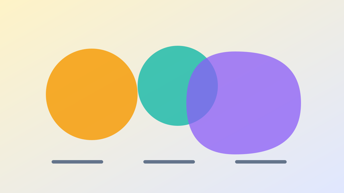
Three shapes for a three-colour day: energy, mood, and wish, side by side, without forcing them to agree.
Frequently asked questions
Does blue always mean calm? No. Blue often feels calm or distant to many people, but it can also feel cold, formal, or sad, depending on shade, context, and personal memory. In your own journal, blue means whatever your entries show it means, and that meaning can change over time. Write a sentence with each blue entry, so that future you can tell whether a particular blue day was calm, flat, thoughtful, or lonely.
Can colour really change how I feel? Colour can influence how a room, a picture, or a page feels, and it can help you notice, name, and remember a feeling, but it does not by itself change a medical condition or replace professional support. It is best used as a creative language for reflection, not as a treatment. If you notice that a particular colour or environment feels restful or energising to you, that observation is useful for choosing how to set up a reflective moment, but it should not be presented as a cure.
How many colours should I use each day? Three is a good starting point: one for energy, one for mood, and one for a wish. If three feels too many, start with one. If three feels too few, add a fourth for a specific part of the day, but keep the total small and always add a sentence. A palette that is easy to repeat every day will teach you more than a complicated system that you abandon after a few days.
What if I am colour-blind, or colours do not feel meaningful to me? Colour journaling is optional, and it is not the only way to reflect. You can use shapes, patterns, textures, words, or numbers instead, or you can use colour in a way that works for you, such as light versus dark, warm versus cool, or saturated versus muted, rather than specific hues. The goal is a label you can recognise at a glance, and that label does not have to be a traditional colour name. If words work better for you, a one-sentence journal, as described in Mood Journaling for Beginners, may be a better fit, and you can add colour later only if it helps.
Should I follow a colour chart from a book or website? Use a chart as a starting point, not as a rule. Charts can suggest associations to try, but your own entries should decide what a colour means to you. Keep a personal dictionary, update it when a colour starts to feel different, and do not force a meaning that does not feel true. A personal palette built from your own days will always be more meaningful than a generic chart, because it was built from your life.
What is the difference between a mood colour and an energy colour? Mood describes how a day feels emotionally, such as content, tense, light, or flat, while energy describes how much fuel you feel you have, from drained to buzzing. They often differ: you can be tired but content, energised but anxious, or calm but bored. Separating them in a three-colour exercise can make your reflection more accurate, because it prevents a single summary word from hiding an important distinction.
Can I use colour to plan tomorrow? You can use a wish colour as a direction, not as a demand. For example, choosing soft green for an unhurried evening can help you notice what kind of evening you would like, and then you can make a small, practical choice that supports it, such as leaving time unscheduled or choosing a quiet activity. That is different from claiming that the colour itself will create the evening. The colour helps you name a direction; your choices, circumstances, and the rest of life shape what actually happens.
How do I review colour entries without overanalysing them? Look at a week or a month of colours together, notice which colours repeat and what sentences go with them, and ask one small, practical question, such as what seemed to go with the calmer days or what small step you might try next week. Avoid turning every pattern into a diagnosis or a rule. Patterns in a journal are observations from your own notes, not proof of cause, and they are best used to suggest gentle experiments, not to make large claims about yourself.
A last note, for the day colour feels like a language
There will be a day when colour stops feeling like a chart and starts feeling like a language. It might be the day you look back over a month of entries and recognise a week at a glance, without reading a single sentence, because the colours tell you what kind of week it was. Or it might be the day you choose a colour for a feeling you could not name in words, and the colour gives you a way to start writing. That moment does not require artistic talent, a perfect palette, or a scientific theory of colour. It requires only that you have been noticing, naming, and returning, one day at a time, with colours and sentences that are honest enough to be useful.
Start with three colours today, or with one if three feels like too many. Write a sentence for each, keep the exercise short, and look back at the end of the week. Over time, your own palette will emerge, built from your own days, your own memories, and your own seasons. That palette will be more meaningful than any generic chart, because it will be yours, and it will make your journal easier to read, easier to remember, and, perhaps, a little more enjoyable to keep. Colour, used this way, is not a shortcut to a different life. It is a way of seeing the life you already have, a little more clearly, in colour.
This article is general information for creative reflection only. It is not medical advice, diagnosis, or treatment, and it is not a substitute for professional help. If you are struggling, please reach out to a trusted person or a professional in your area.